Andy Warhol: In Black & White
Words by J. Miller
Edited by Myfanwy Greene
Earlier this year, I had the privilege of attending the Lakeside Arts exhibition Andy Warhol: Pop Icon at the Djanogly Gallery in Nottingham. showcasing a variety of Andy Warhol’s work, which spanned the entirety of his career. What struck me most about this display was the abundance of his lesser-known works, including some of his sketches, drawings, and earlier prints.
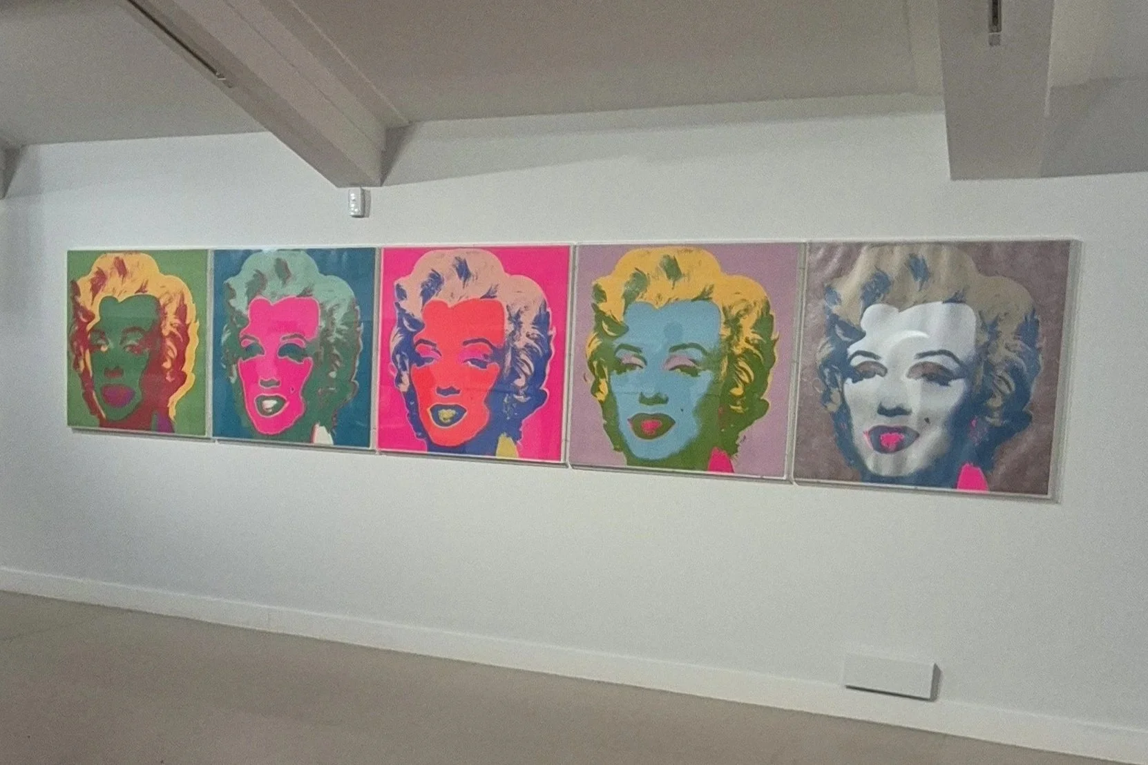
Andy Warhol, ‘Marilyn (Complete Set)’, 1967. Image taken by author.
As much as I enjoy his more famous works, for example his screen prints of Marilyn Monroe, I couldn’t help but feel his sketches were that bit more personal. It is often said that Andy Warhol focused his artworks on Americanism and what it means to be truly American. However, these sketches felt more like an insight into Warhol himself, like a window into his soul. They touched on more delicate themes of sexuality, a theme often left out of his later works.
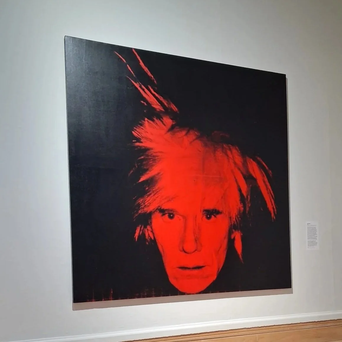
Andy Warhol, ‘Self Portrait’, 1986. Image taken by author.
Unlike Warhol’s later artworks, these are sketches — not screen prints — and so they lack the bright, vibrant colours with which he is most often associated. Perhaps his choice of ink on paper, as opposed to screen print, could be tied to him not seeing his sexuality as being particularly American, the ink being a subtler medium. Although the stripping away of vibrant colour may feel wrong to some audiences, or inherently anti-Warhol, I would argue it is just another perspective. As we will come to see, these pieces were rejected by the art community at the time, furthermore, many have said that Warhol himself felt out of place in a Post-War USA that valued a so-called 'toughness’ over emotion.
One such sketch is entitled Resting Boy, and was intended by Warhol to be displayed at Tanager Gallery, although this would never happen due to ‘macho painters’ at the gallery dismissing the work outright.
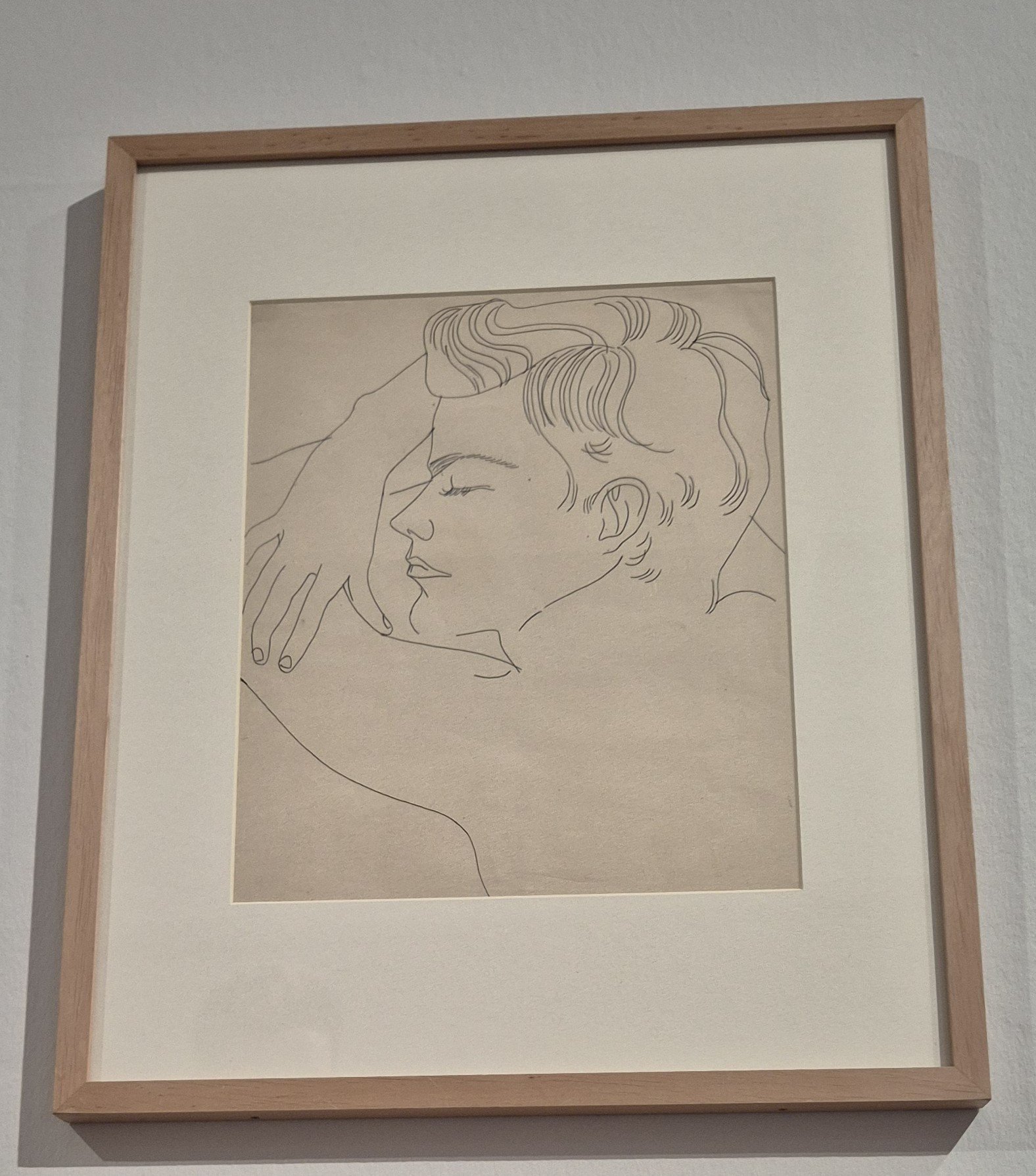
Andy Warhol, ‘Resting Boy’, 1955-57. Image taken by author.
The boy appears at peace, sleeping with both arms crossed beneath his head, acting as a pillow. It feels loving and sweet, as though his partner is watching over him and can’t help but admire how beautiful he looks in his slumber. The simple line drawing only allows for the boy to be seen, focusing the piece entirely on him — he takes up the whole frame, there is no background to distract from him. Our gaze from (theoretically) the position of his partner shows only an interest in him: where he is sleeping does not matter, his clothes do not matter, he is not sexualised. He is just sleeping. He is just loved.
This monochrome tenderness completely juxtaposes many of Warhol’s later screen prints. This work is not intended to be bold or visually jarring, but instead soft, just like the moment you find your partner asleep on the sofa after work. The method is used intentionally, meaningfully, lovingly. To me, there is far more to say about this artwork than almost any of his screen prints.
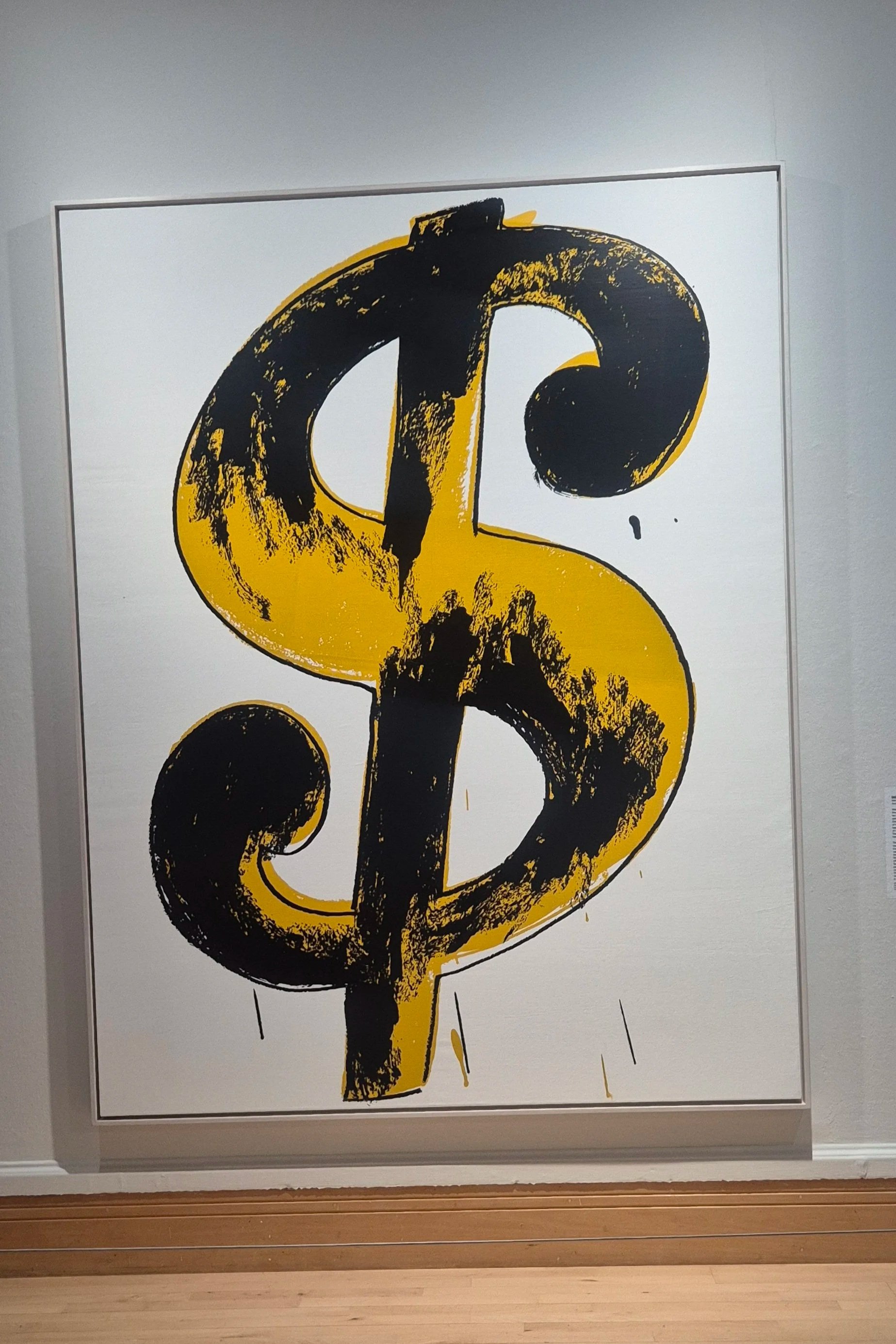
Andy Warhol, ‘Dollar Sign’, 1981. Image taken by author.
Regardless, I feel that it is undeniable that this piece carries a more hidden aspect of Andy Warhol that should be explored more. He became one of the greatest artists that the world has ever seen, but does the world really know him or has it invented its own version of him to remember?
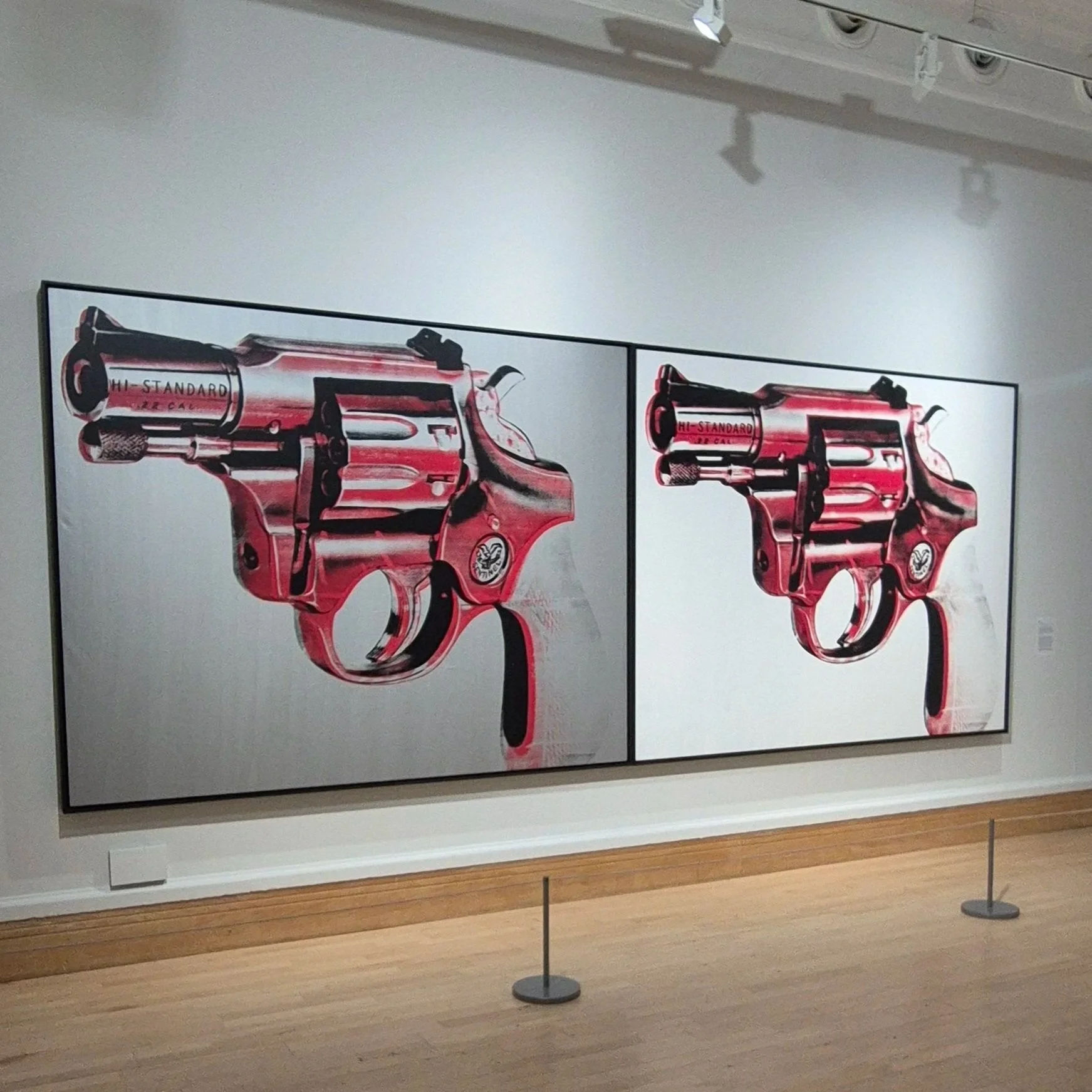
Andy Warhol, ‘Gun’, 1981. Image taken by author.
The Andy Warhol: Pop Icon exhibition is showing in Nottingham until April 19th 2026.
https://www.lakesidearts.org.uk/exhibition/artist-rooms-andy-warhol-pop-icon/