
Never Judge A Book By Its Cover…Or Should You? Examining different portrayals of the female body on book covers
Words by Georgina Way
Edited by Georgina Way
In the summer of 2015 the literary scene of the Upper Class, Barbour Jacket, champagne-at-lunch, ‘you-must-come-for-coffee-darling,’ riding and shooting set were up in arms about the redesign of Jilly Cooper’s famous novel RIDERS. Unusually, instead of being ‘sexed up’ it had been ‘sexed down.’
First published in 1985, RIDERS Was the first of Cooper’s bestselling ‘Bonkbuster’ series, featuring the extraordinarily handsome but morally questionable Rupert Campbell-Black. The original cover depicted a woman’s backside in tight jodhpurs with a riding crop and a man’s hand snuggly cupping one cheek. Because that is what the book is about. So they say. But don’t let the cover deceive you - it is a social history, exploring themes and problems facing 1980s Britain with the ever present class divide debate bang in the middle. And the book (and the cover) was an immediate success.
But in 2015, for the 30th anniversary of RIDERS, the cover was altered slightly so that the man’s hand was caressing the lower back. Although still suggestive, it is not as sexy and eye-pleasing or unsettling (take your pick) as the original. Debates immediately sparked off across the literary world. Many influential people, including women, rushed to defend the original cover. Germaine Greer (who will be mentioned again later) said, “It does sound like a sort of correctness, doesn’t it?” By changing the cover and eliciting these strong emotions, is the meaning, and the innocent fun of a ‘Bonkbuster’ tampered with. Victoria Hislop described it as “bland” and “totally unsexy.” Jilly Cooper herself disapproved of the new cover, implying that as a society we are becoming too sensitive and feeble. Is that the case or are we now giving women, and the female body, the respect they deserve? But the cover was never intended to be disrespectful…it’s a cyclical argument with equally strong points of view on either side.

The two covers of RIDERS. The original 1980 cover is on the left.
A sexually ambiguous cover is nothing new and the same arguments surrounding them, such as whether bodies (normally female) are being portrayed as objects of fantasy and as a way to lure readers in and buy the book. It could be argued that it is a manipulation of the human form. However, these covers are sometimes chosen for the exact opposite reason: to make that point. Germaine Greer’s The Female Eunuch, 1970, became an international bestseller and a very important piece of literary work during the Feminist Movement. Although at first glance the cover is unsettling, grotesque even, it is actually an empowering symbol of the Feminist Movement.

An example of the front cover of Germaine Greer’s The Female Eunuch
Wuthering Heights is an example of a book with many editions and therefore many variations of cover. A common misconception is often that the book tells one of the greatest love stories of all time; nothing could be further from the truth. It is a tale of passion, cruelty, obsession and class conflict with liberal amounts of violence spread throughout. But a love story it is not. Some depictions, such as various Worsdworth editions depict the Yorkshire Moors (arguably the main character in the book) and sometimes ‘Top Withens’ - supposedly the inspiration for the setting of the novel. Having this on the cover is far more accurate than frequent depictions of Cathy and Heathcliff locked in a loving embrace in which Cathy is shown as being meek and gentle. Anyone who has read Wuthering Heights will know that Cathy is anything but. Depicting Cathy like this is actually an insult to Emily Brontë and undermines her extraordinary talent she must have had to write a book as haunting, chilling and captivating as Wuthering Heights.

A Wordsworth edition of Wuthering Heights depicting the Yorkshire Moors
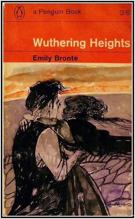
A Penguin edition of Wuthering Heights depicitng Cathy and Heathcliff in a loving embrace
Another example of a novel’s heavy and impressive themes being undermined by a distracting cover would be Faber & Faber’s 50th anniversary edition of Sylvia Plath’s The Bell Jar. By featuring a young woman applying makeup and surrounded by a bright, pink, ‘girlie’ background, the weight and strength of the book’s themes, such as deep depression, were trivialised. Faber & Faber argued that the new aesthetic would hopefully encourage a new generation of readers to read Slyvia Plath but ultimately the critics slammed the cover down as being similar to that of ‘chick-lit’ and wholly unsuitable for the topic of the book.

Faber & Faber’s cover for the 50th anniversary of The Bell Jar
It can often be forgotten that book covers are works of art and can have a huge impact on the readers of the book and also on society at large. The, sometimes unwitting, sexualisation of women and the female body on covers has been a problem since the 1940s when the depiction of the female body as a primary marketing tool erupted during the paperback, pulp fiction, era.